Swan Bathhouse
Brand Identity + Logo Design
Challenge
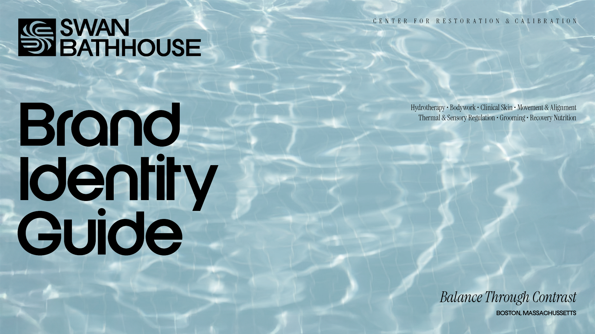
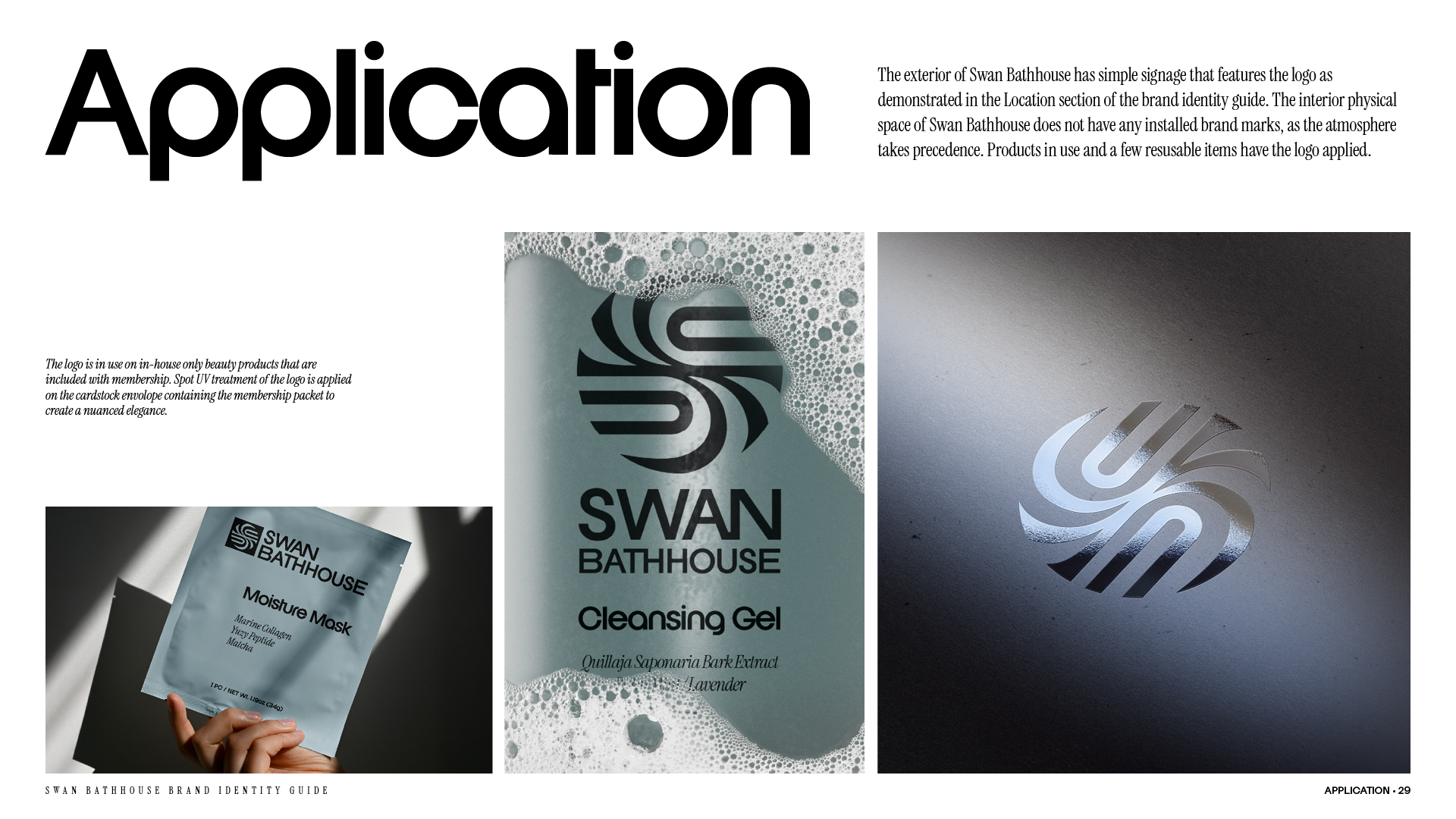
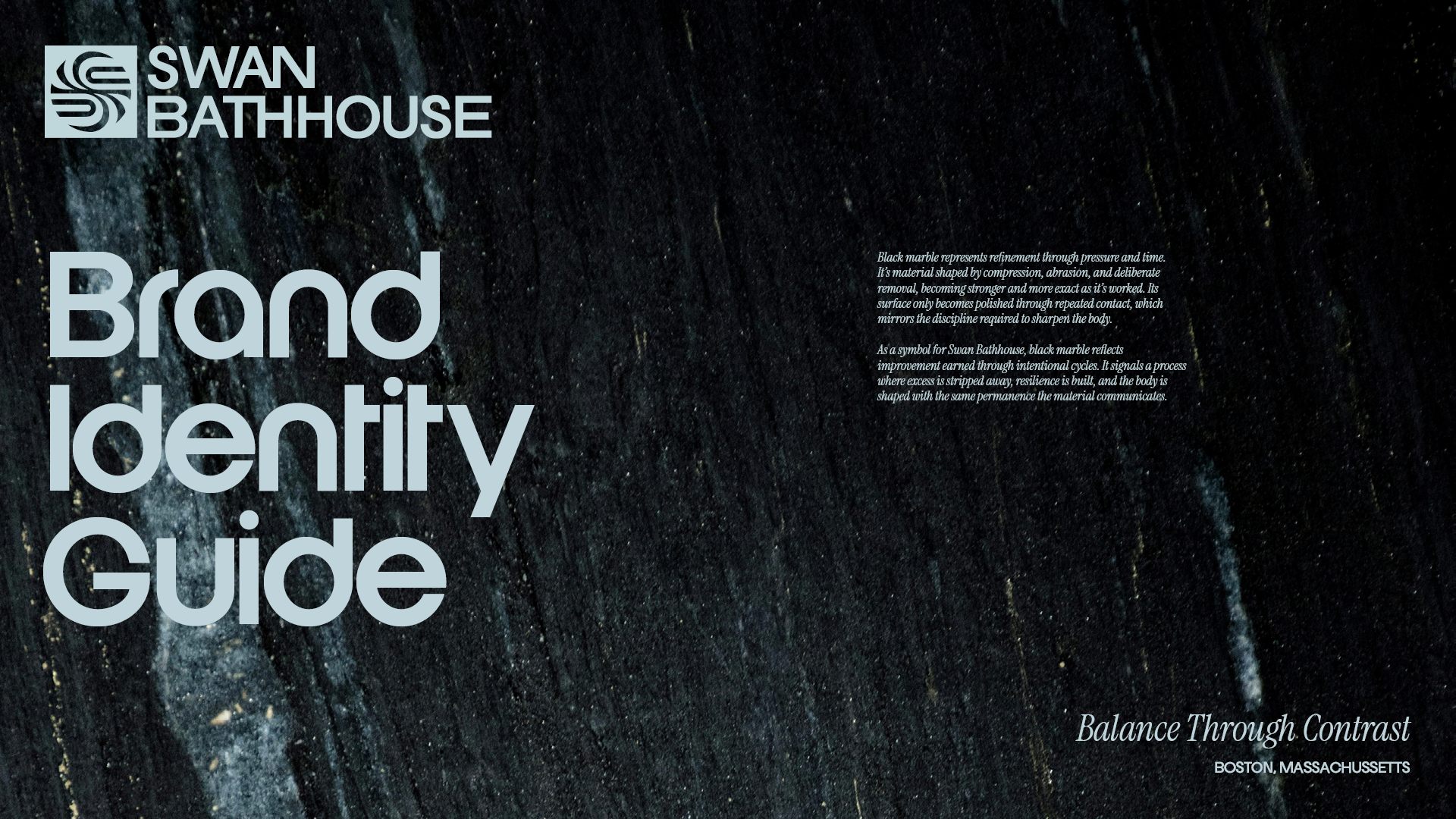
Swan Bathhouse needed an identity that expressed the elegance of their space and the duality at the core of contrast hydrotherapy.
Strategy
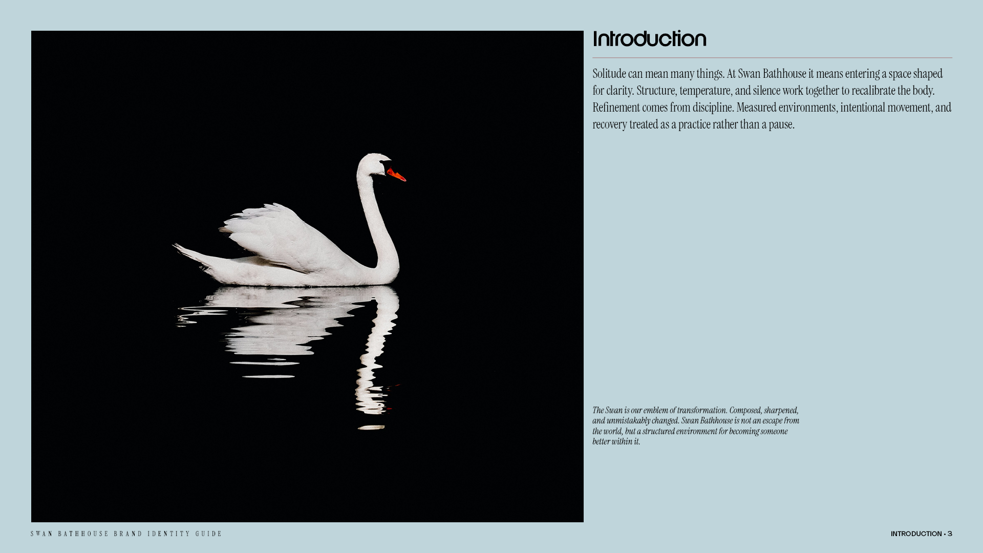
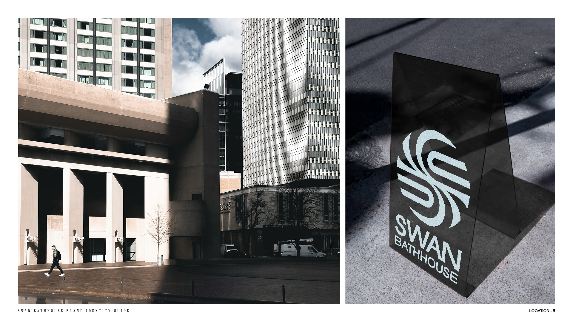
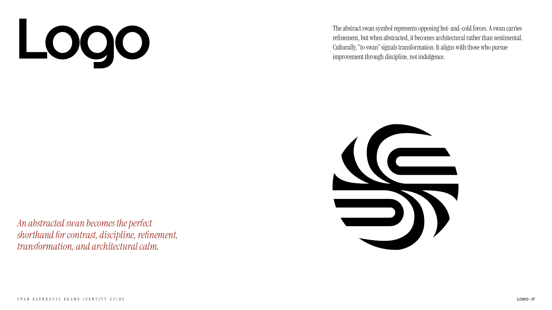
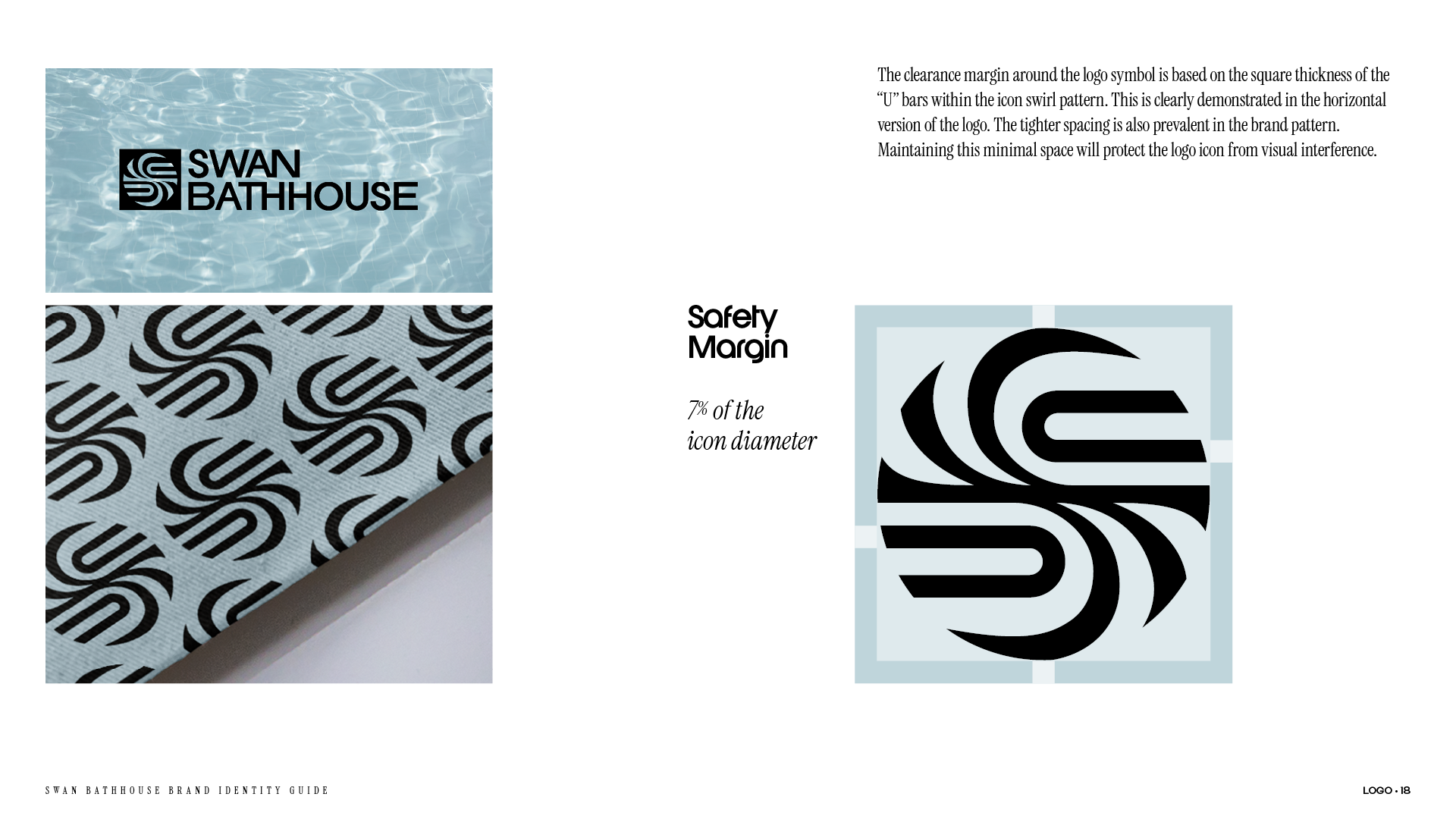
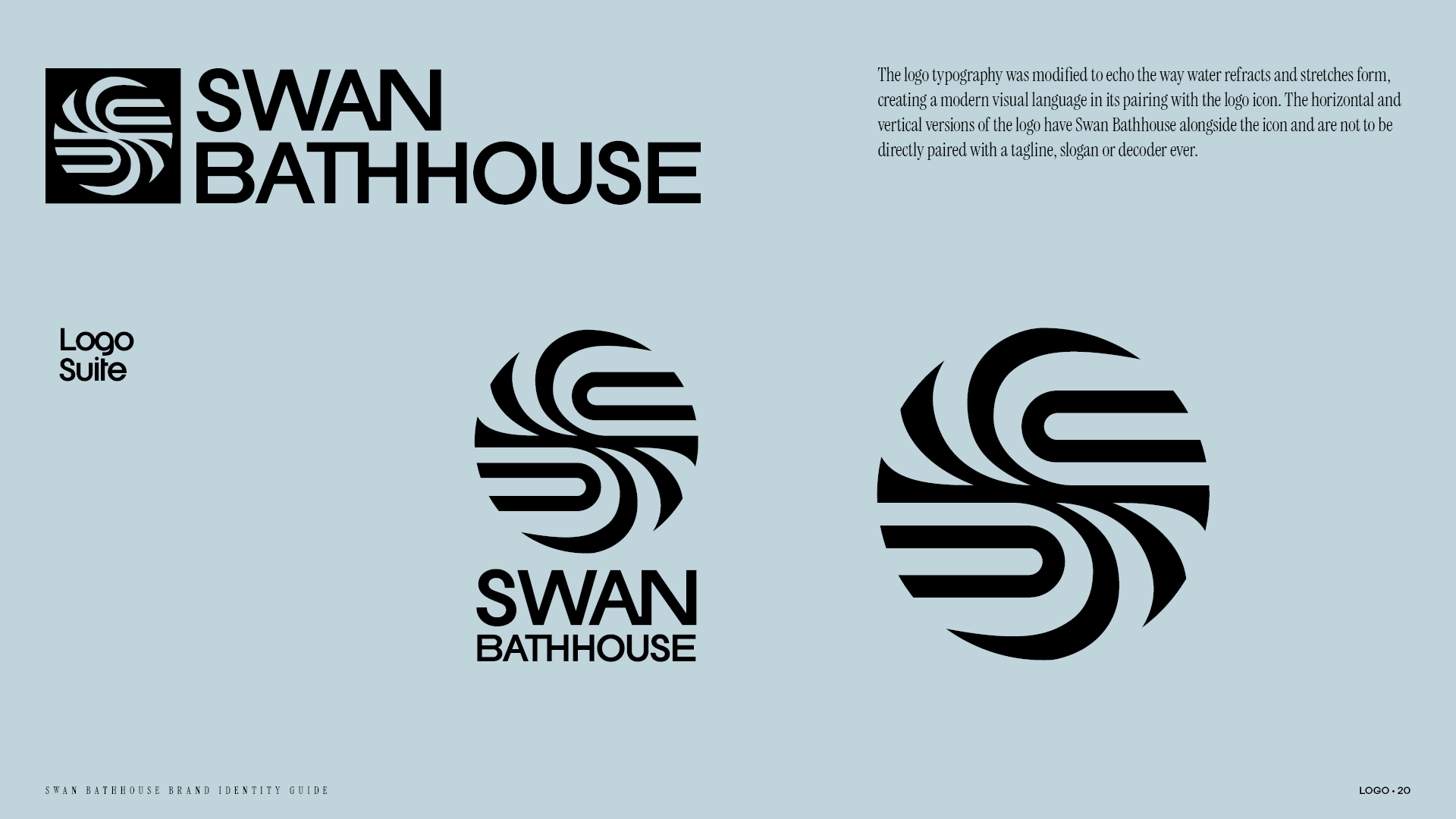
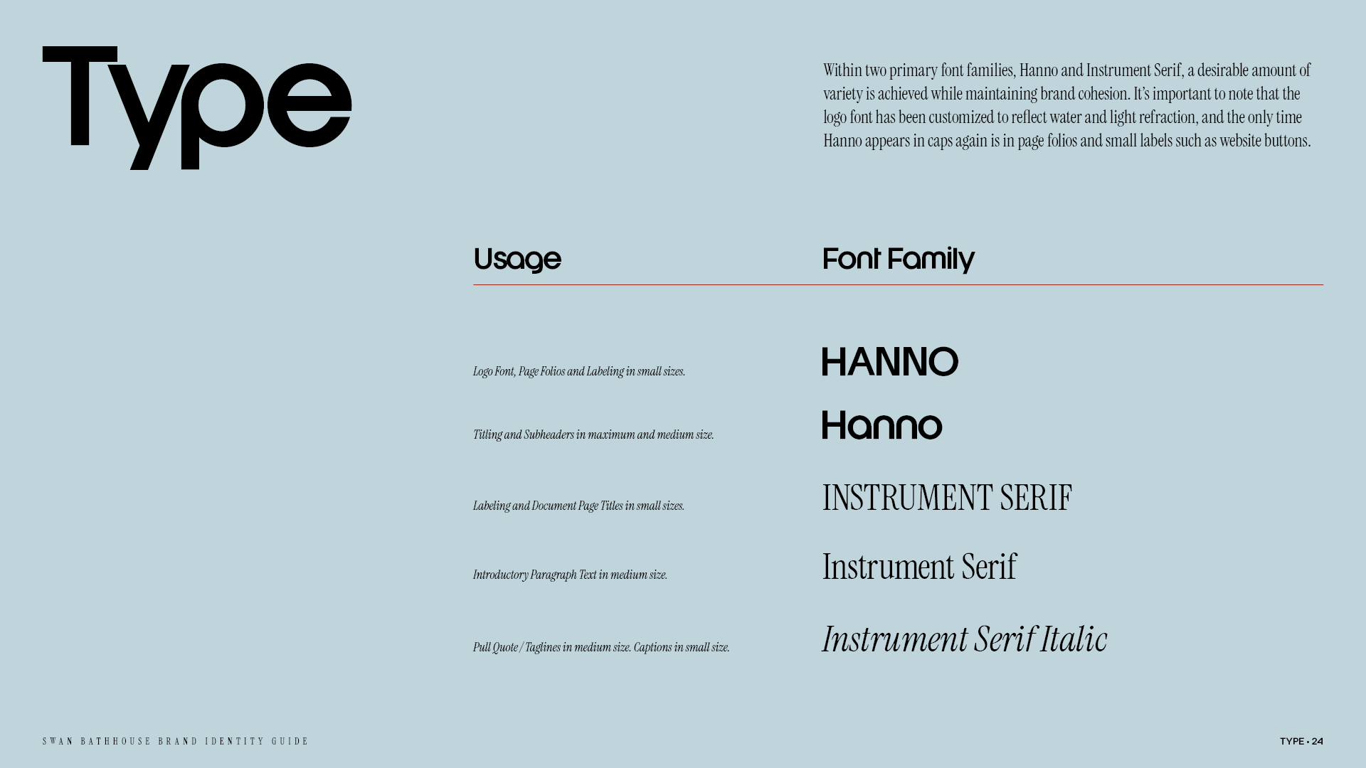
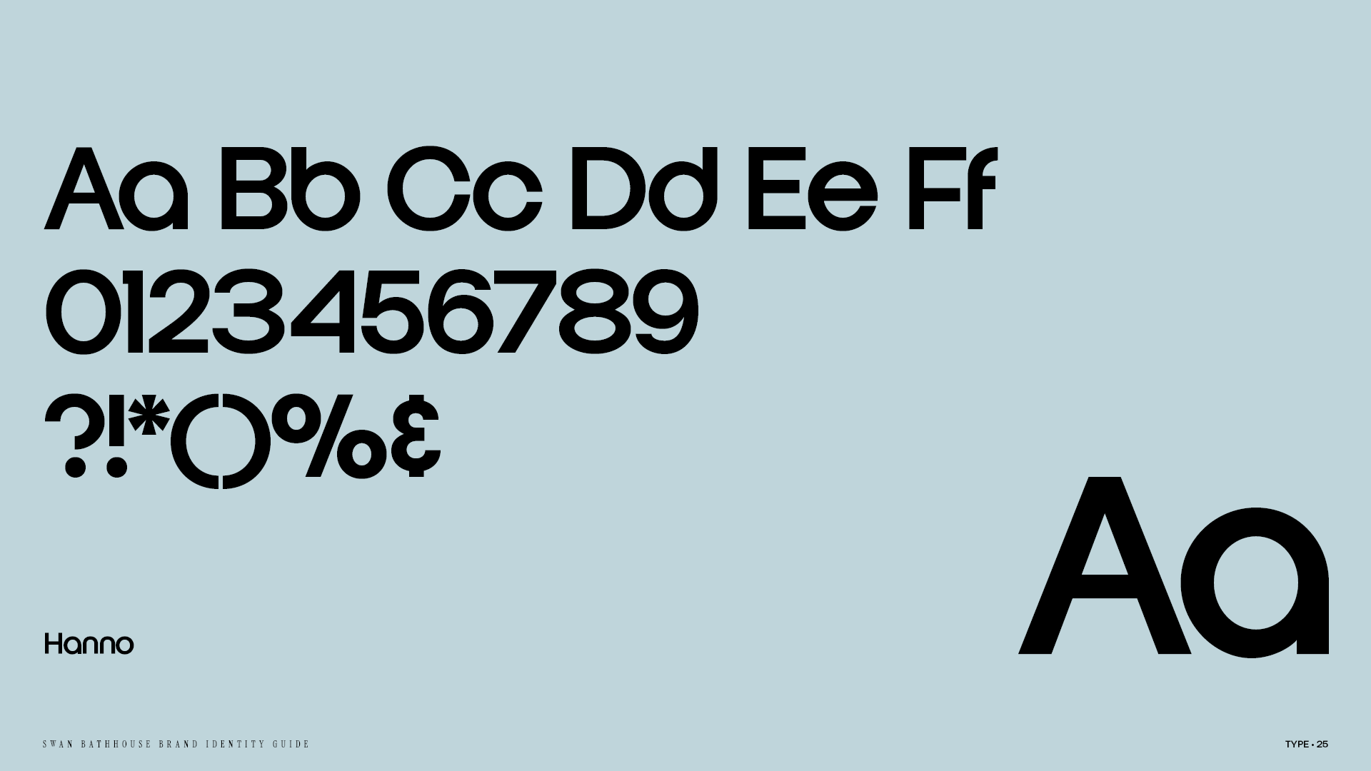
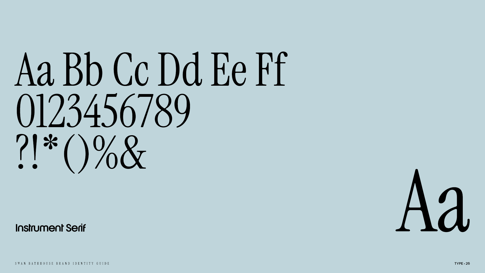
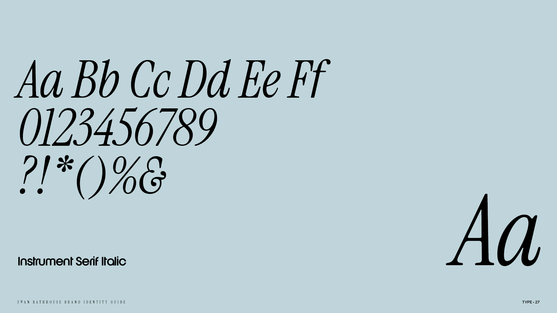
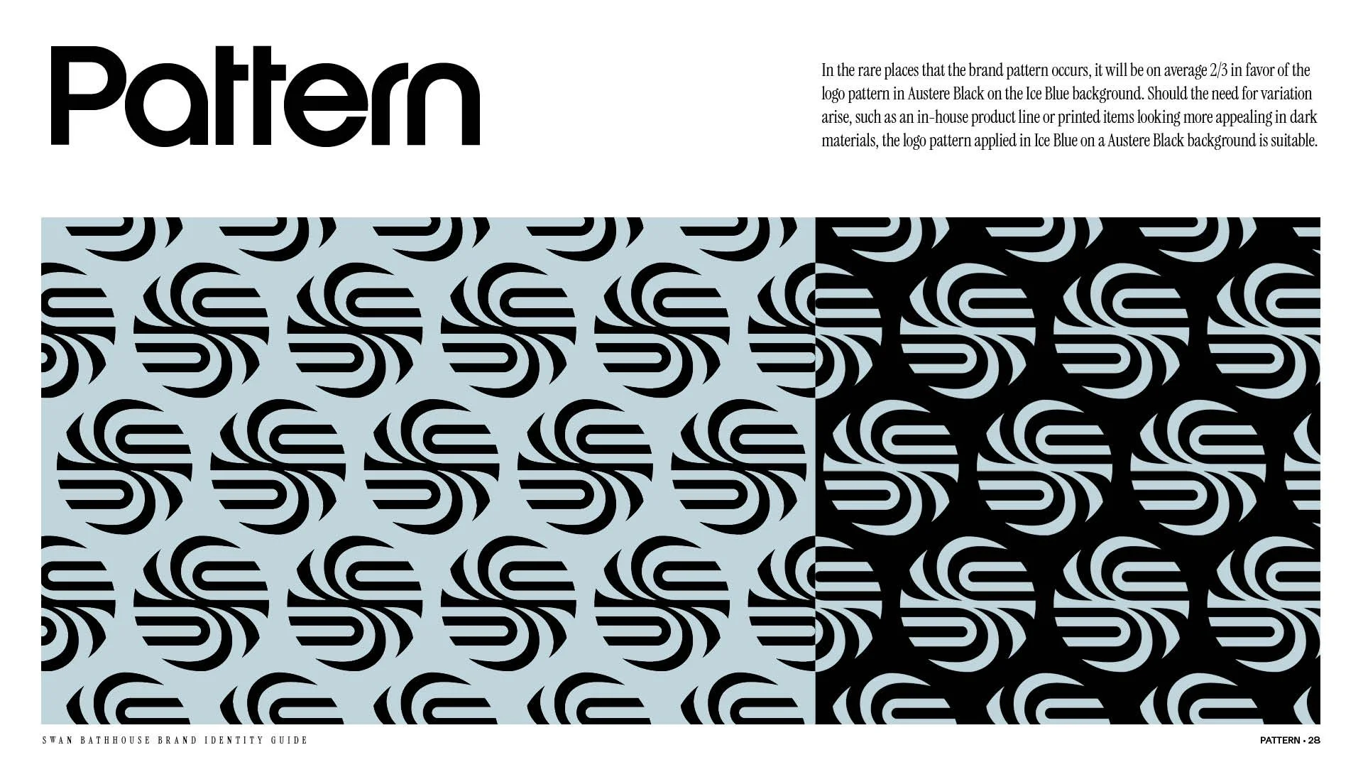
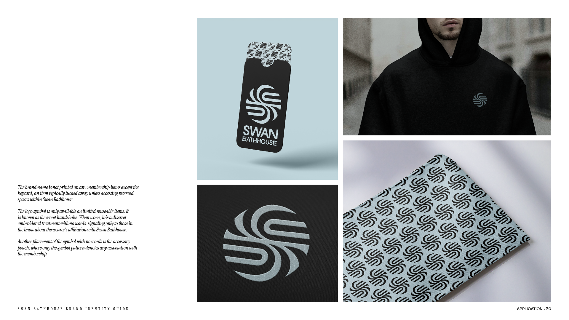
I designed an abstract swan symbol that also represents opposing hot‑and‑cold forces. The typography was modified to echo the way water refracts and stretches form, creating a serene yet modern visual language.
Outcome
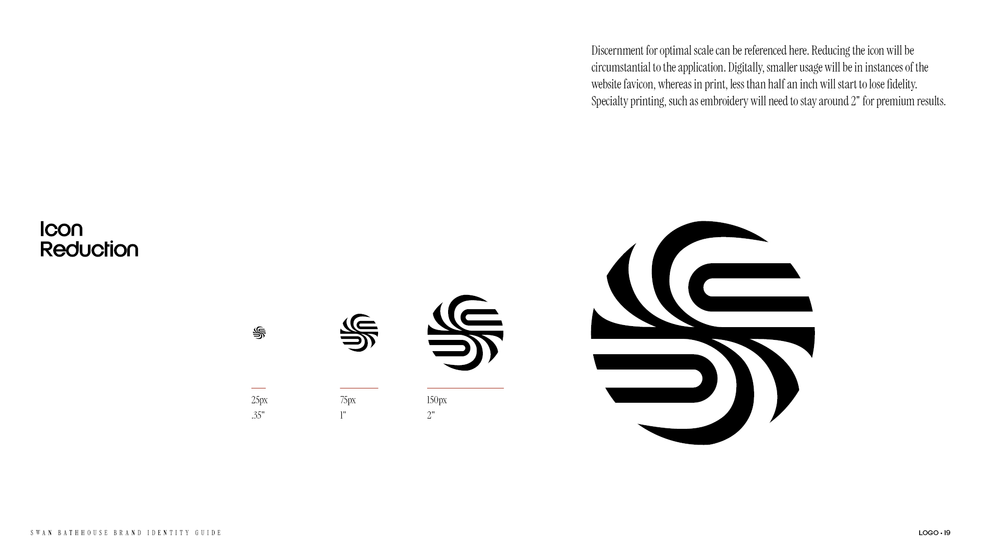
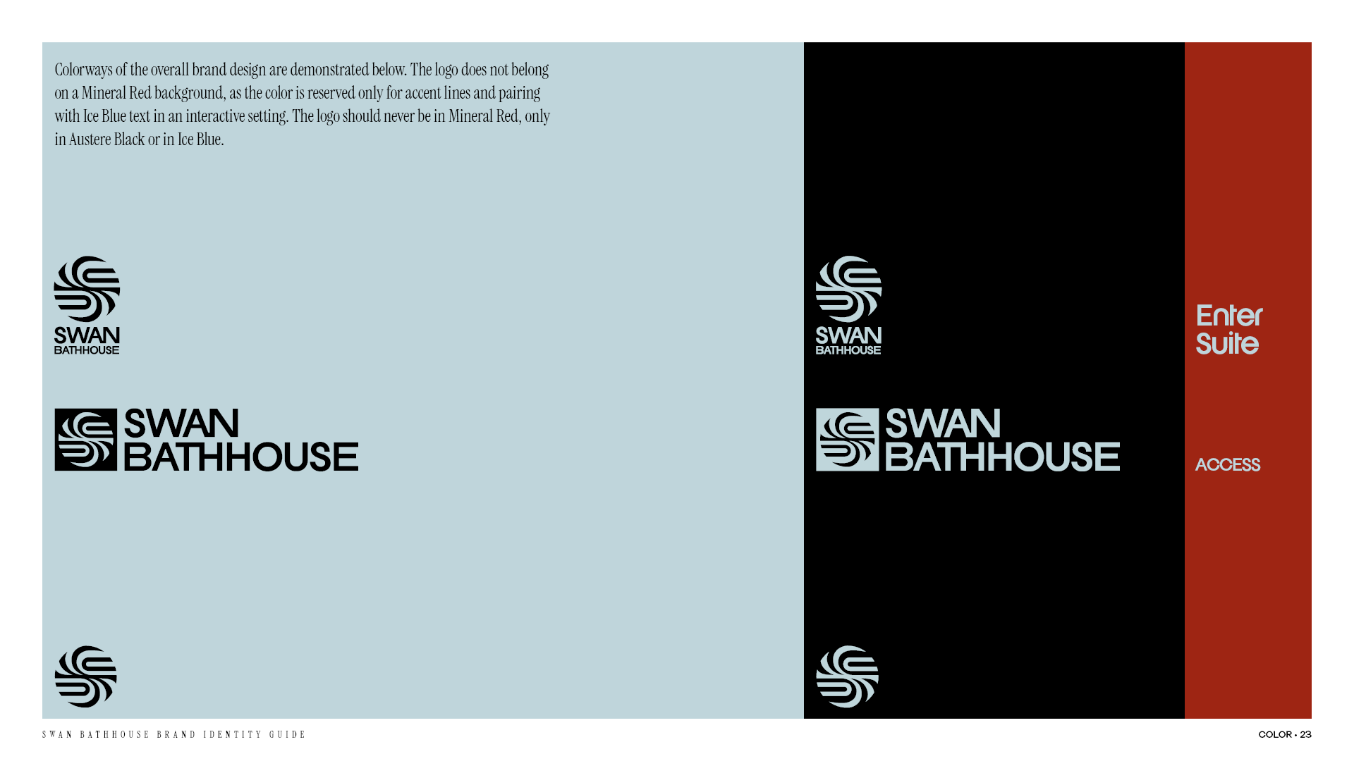
The final identity is refined, symbolic and distinctive. The mark reduces cleanly, stands alone and sets Swan Bathhouse apart within the wellness and hydrotherapy space.