Campbell Family Homes
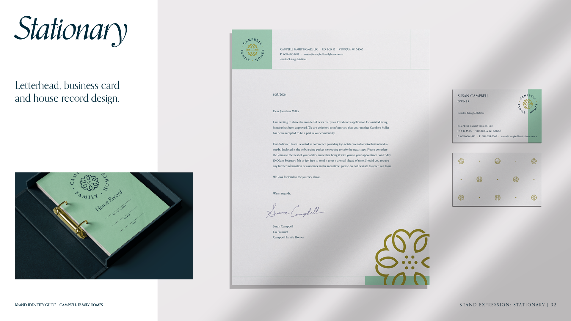
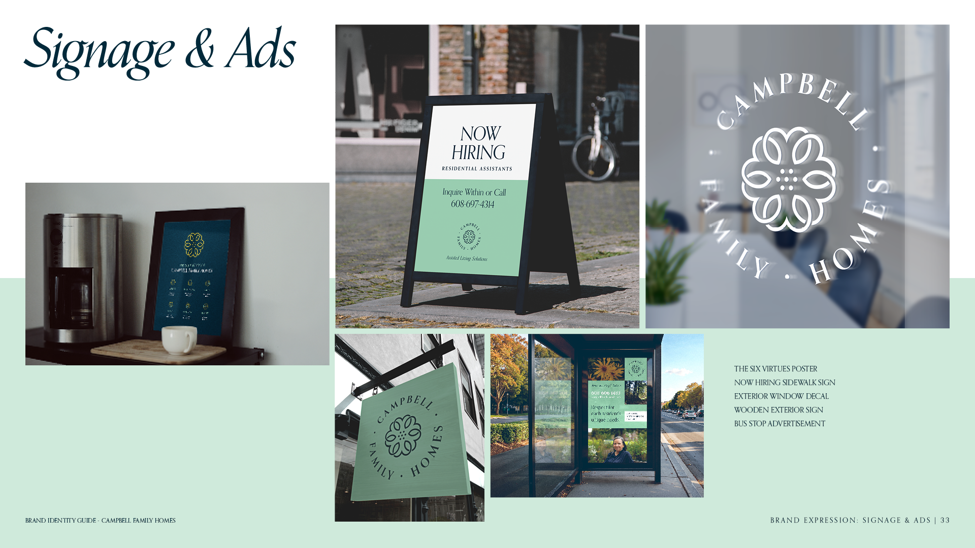
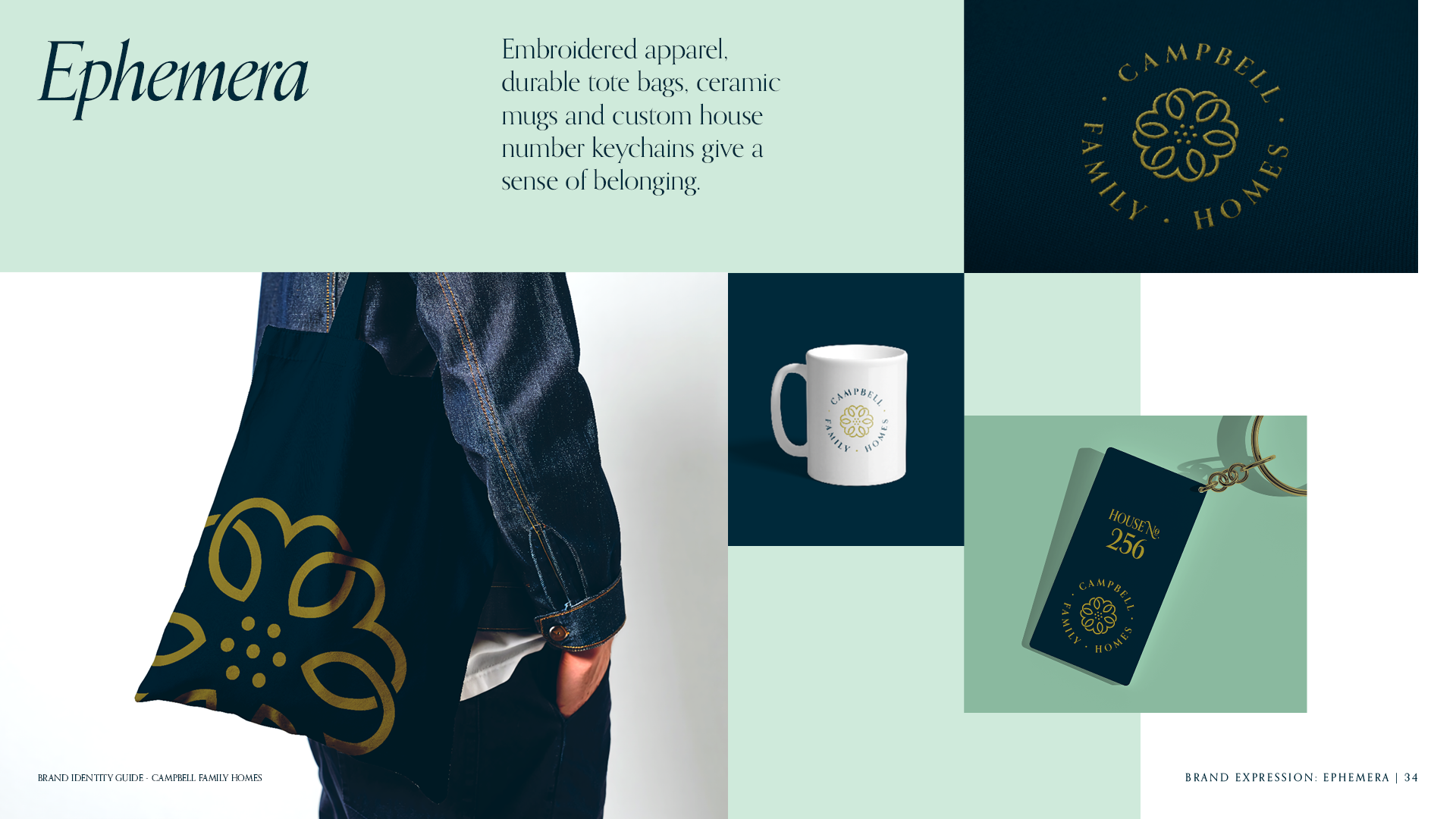
Brand Identity + Logo Design + Website Design
Challenge
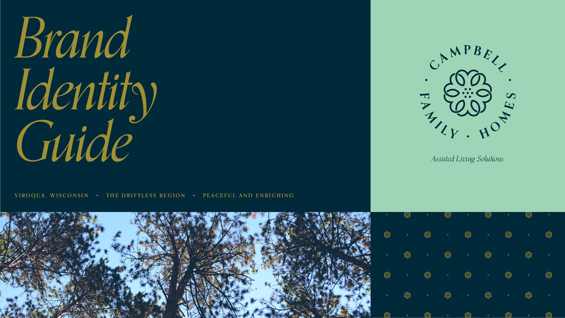
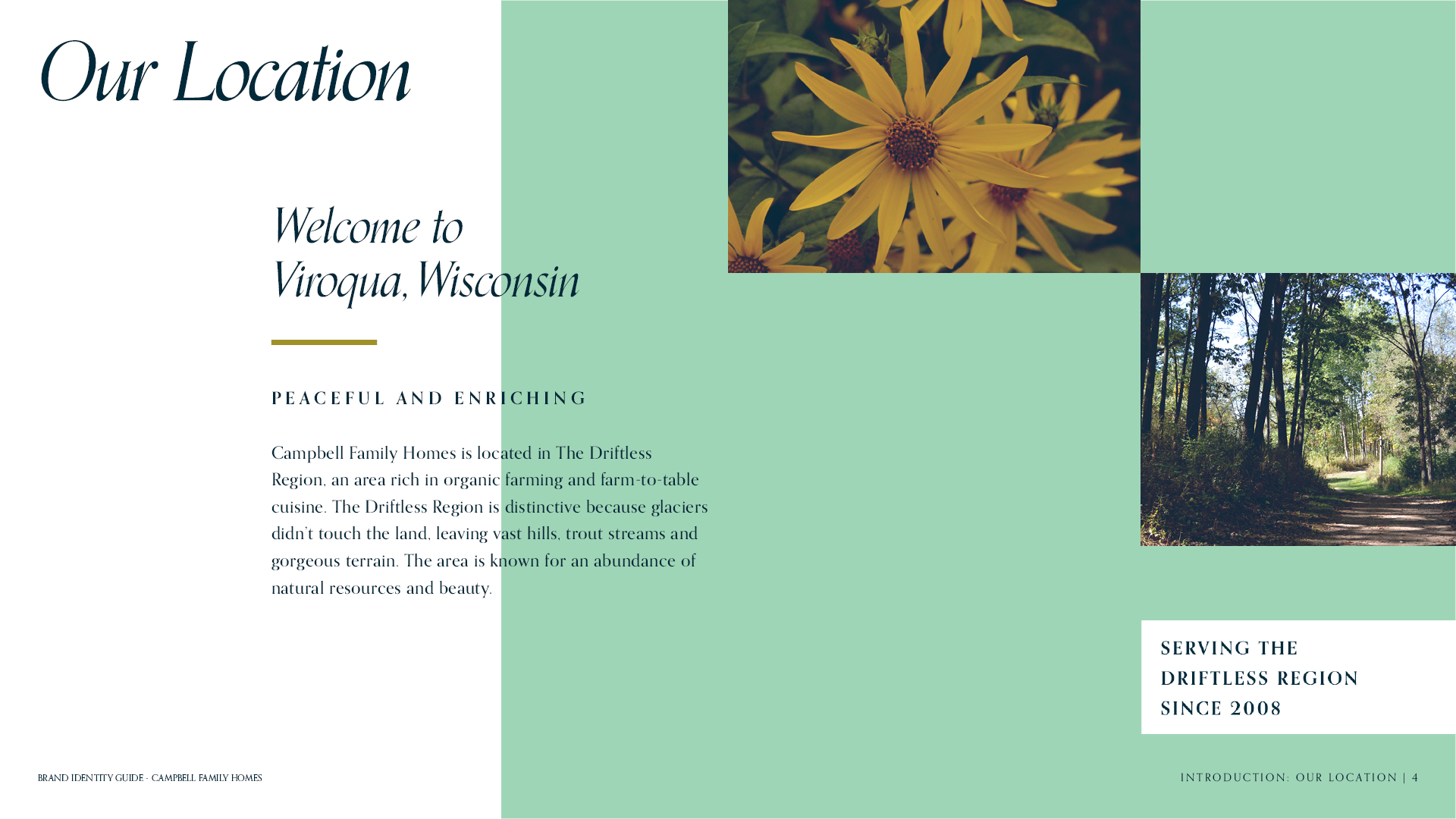
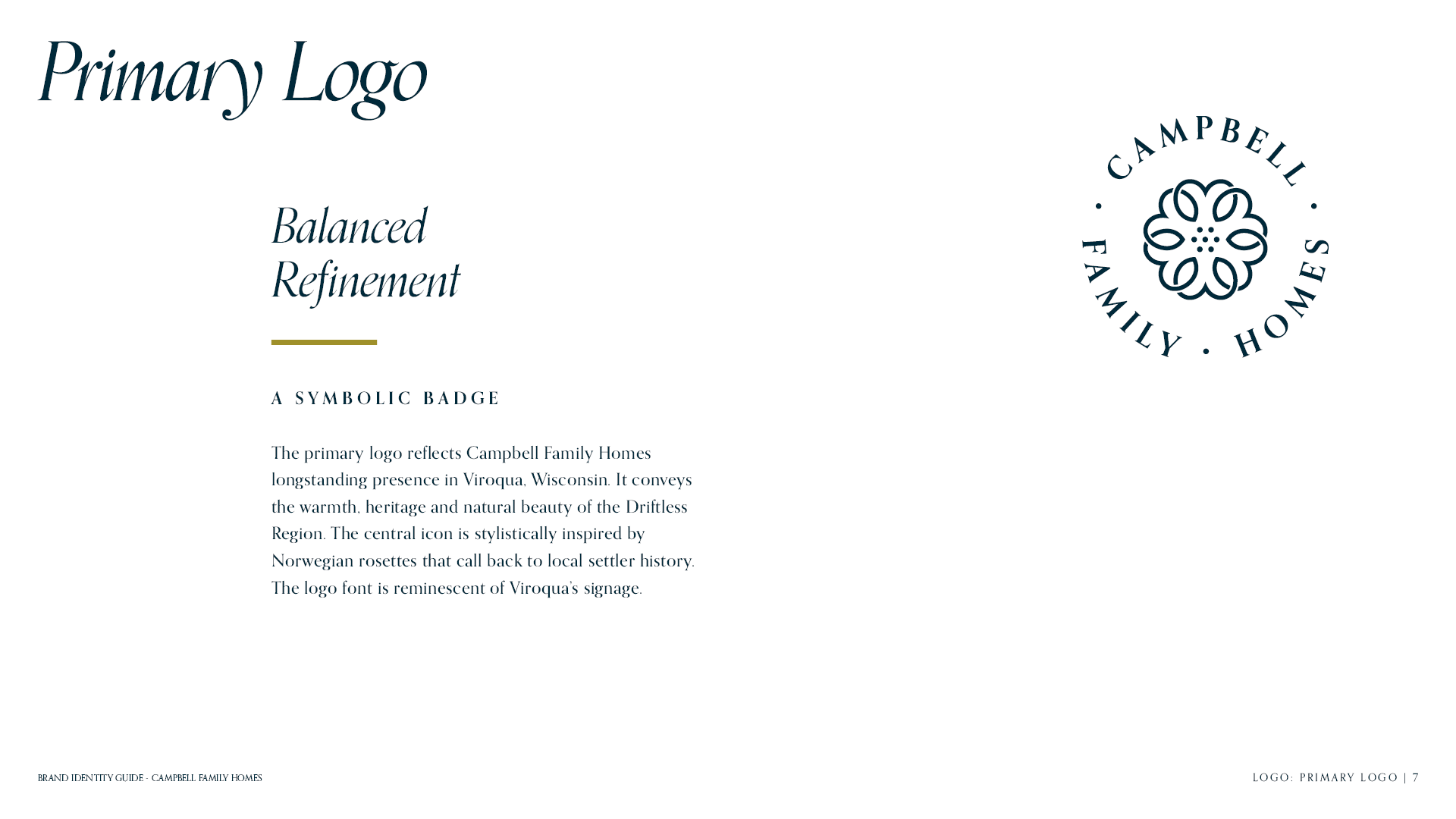
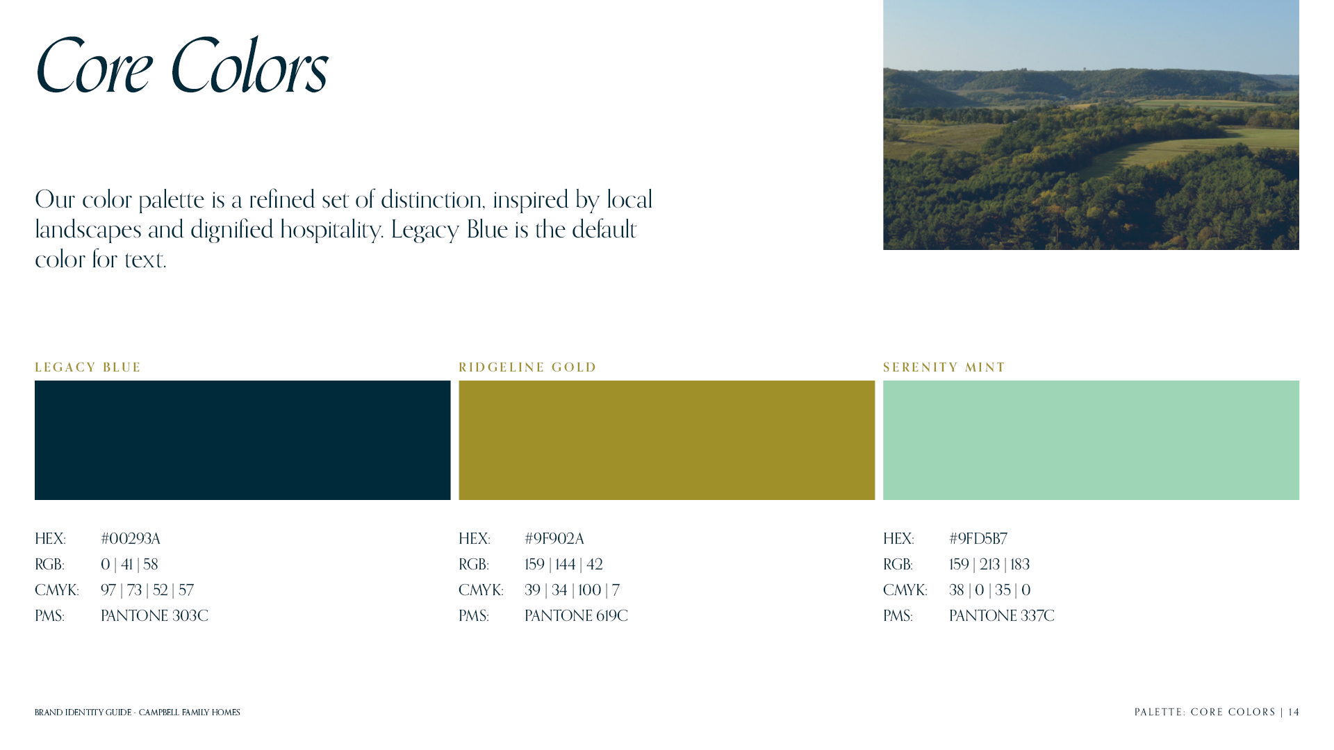
Campbell Family Homes needed an identity reflecting their longstanding presence in Viroqua and conveying the warmth, heritage and natural beauty of the Driftless Region.
Strategy
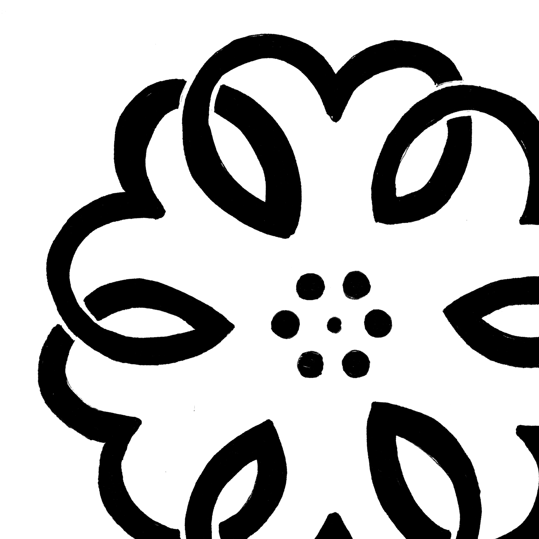
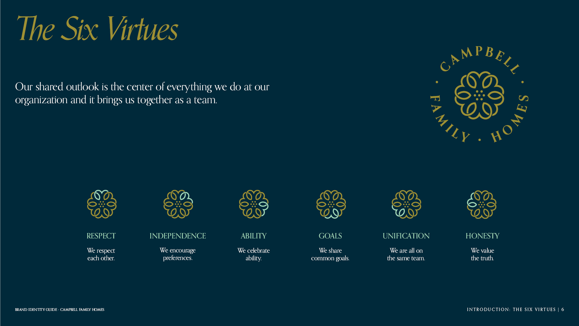
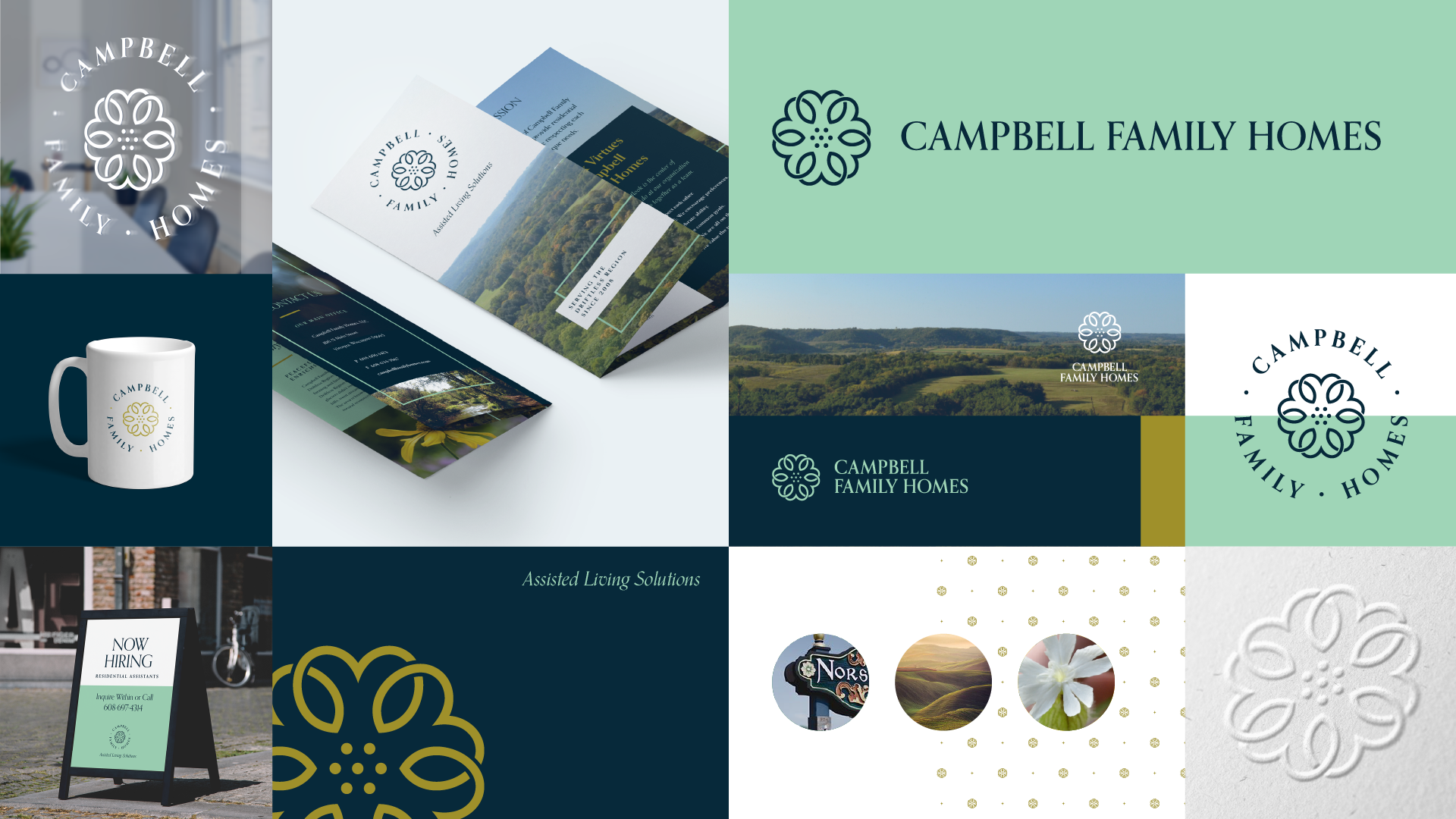
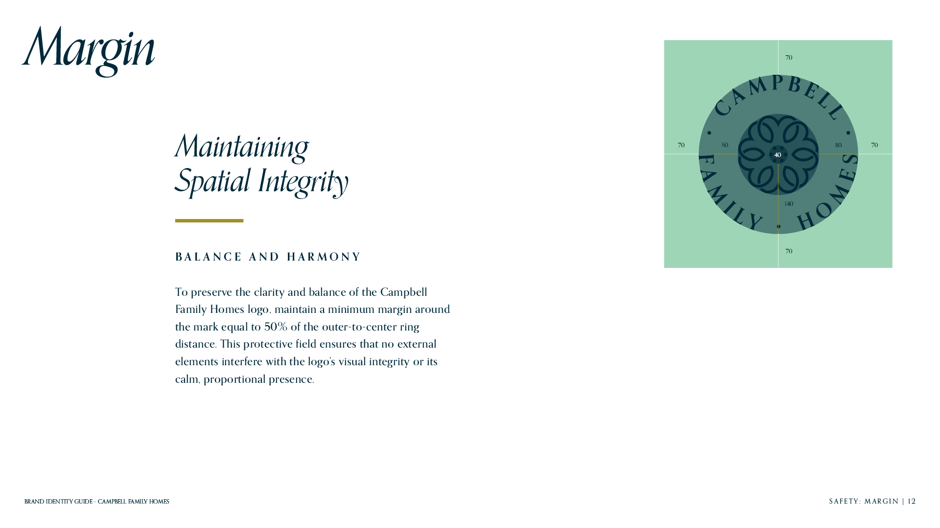
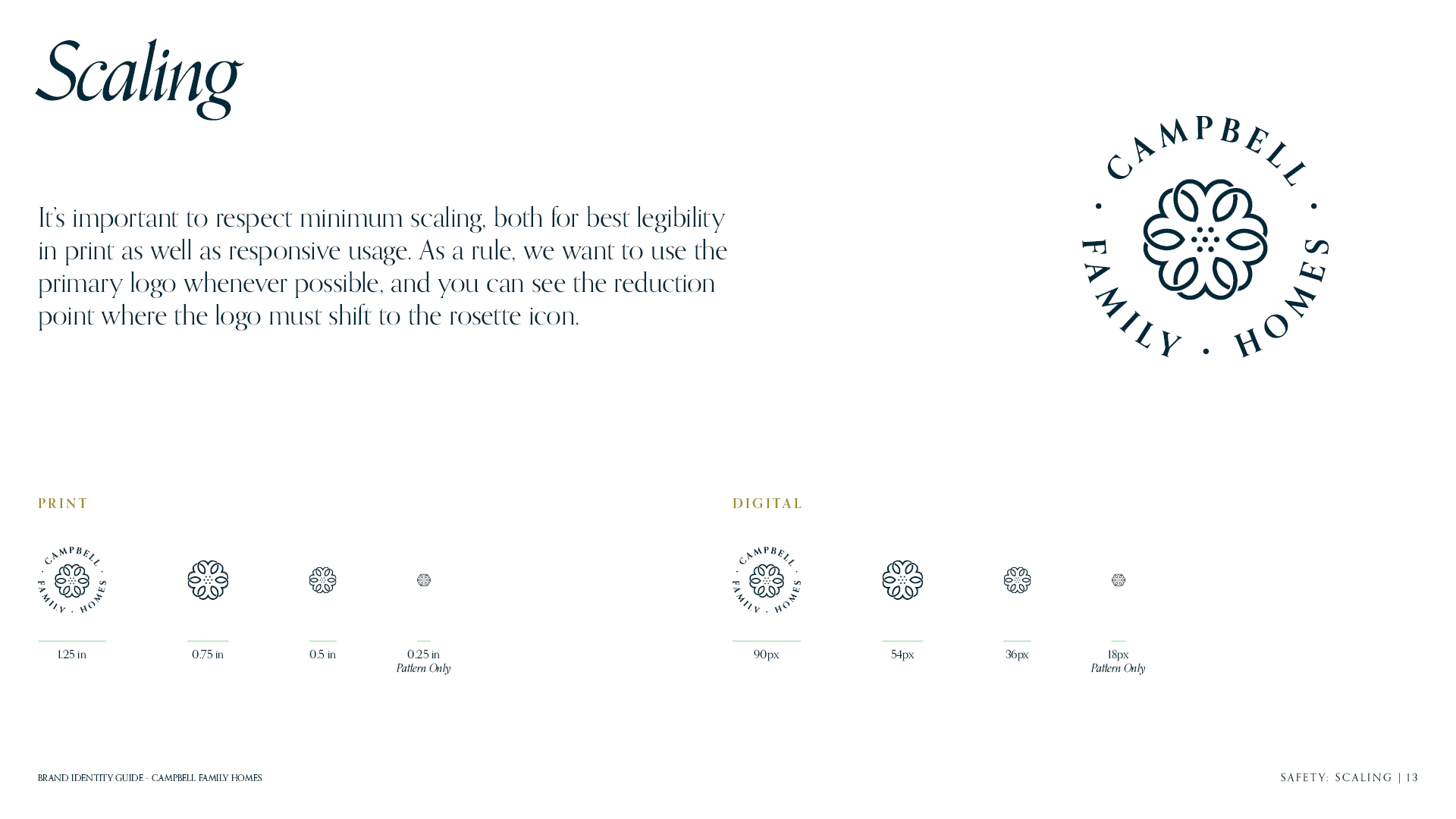
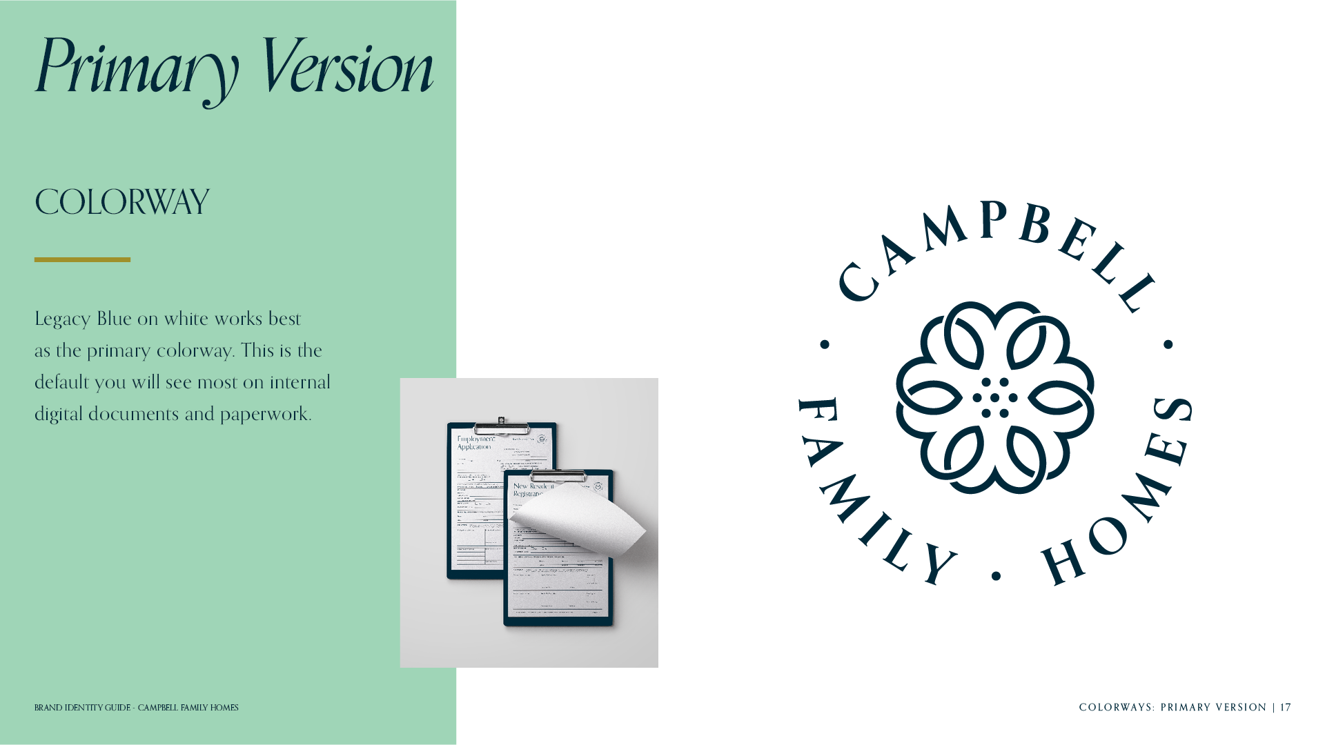
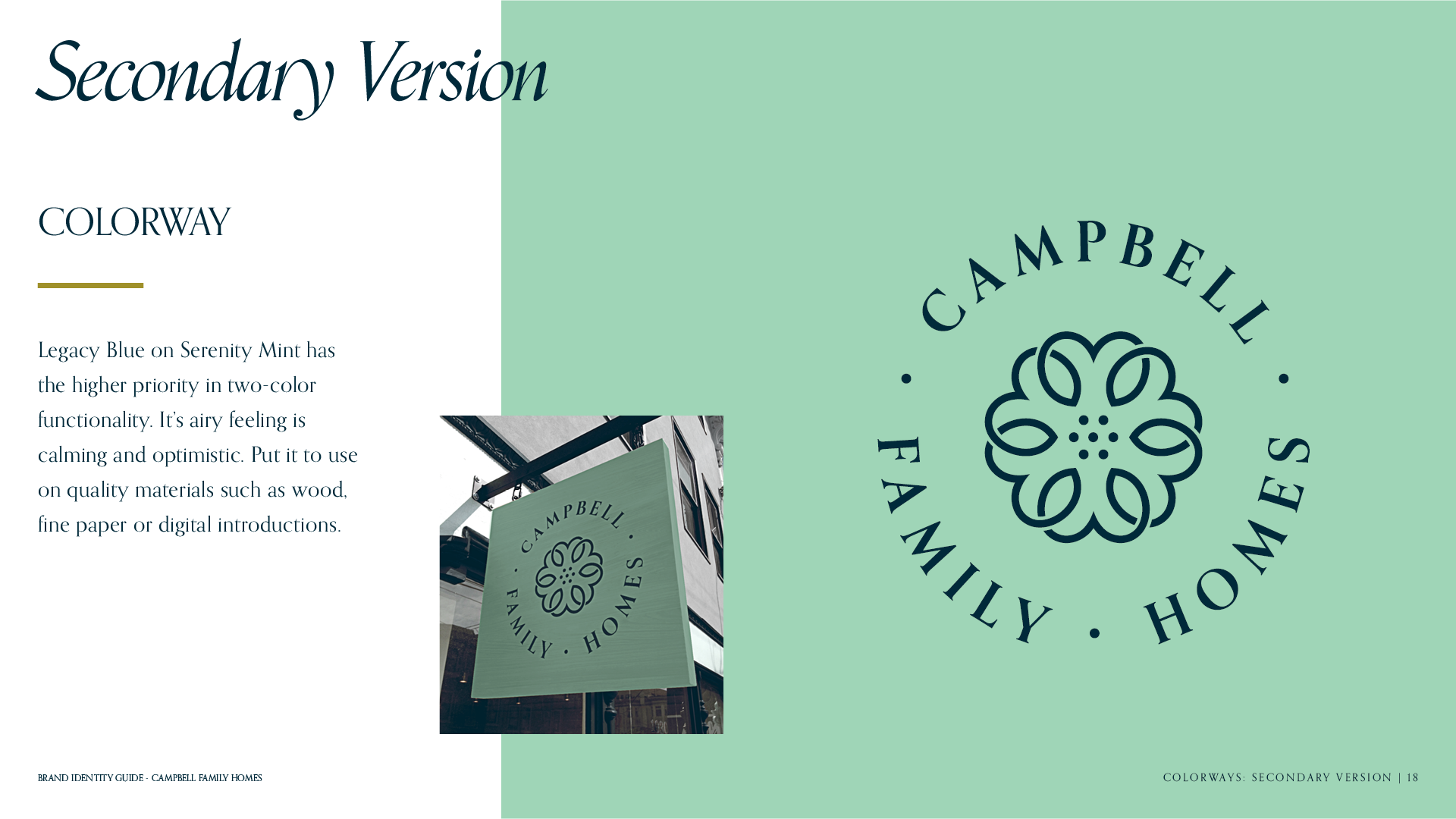
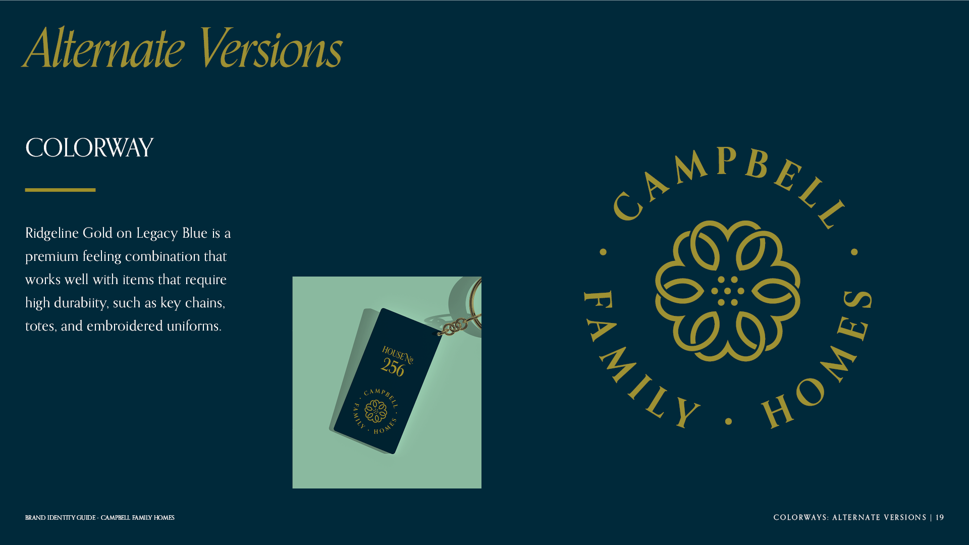
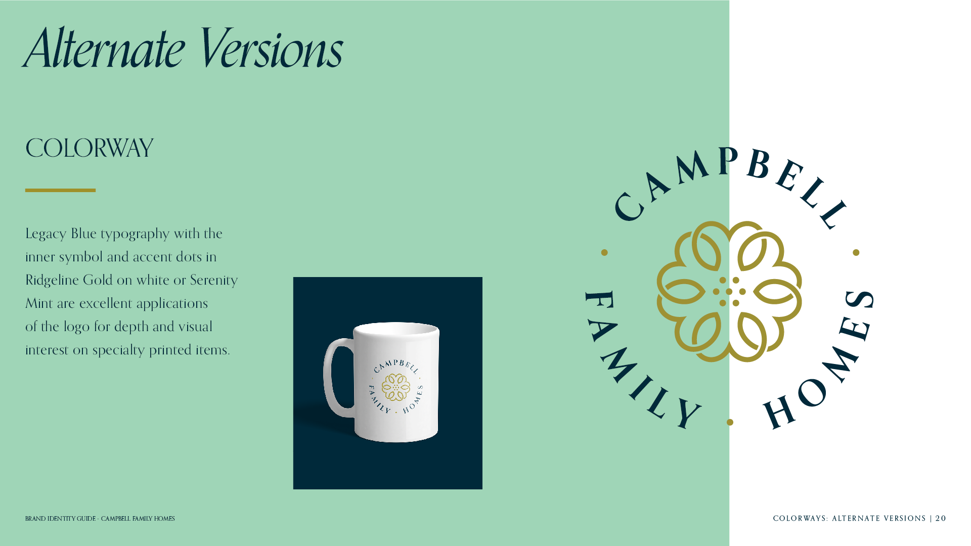
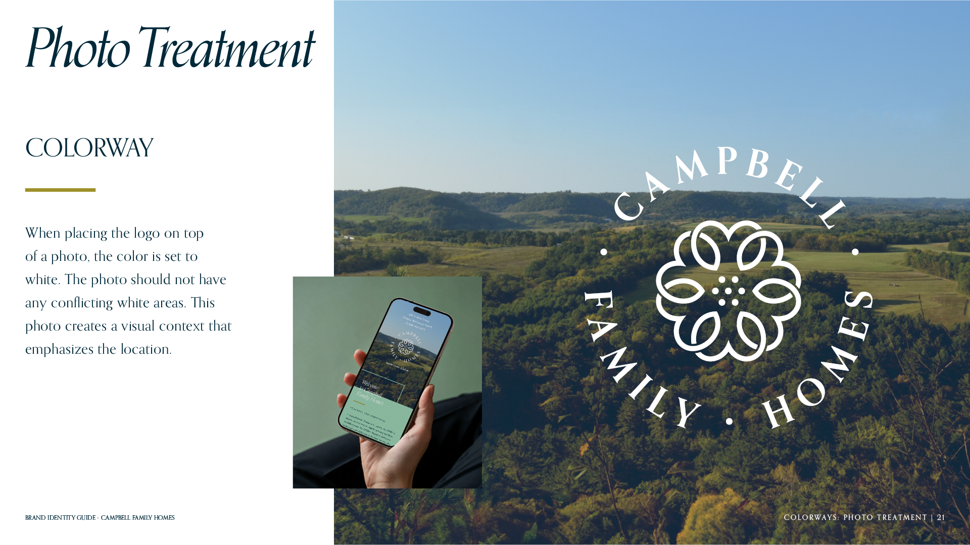
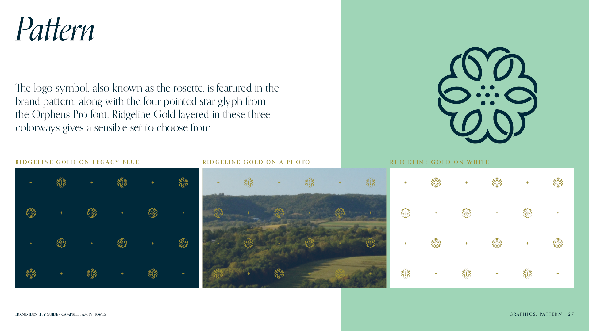
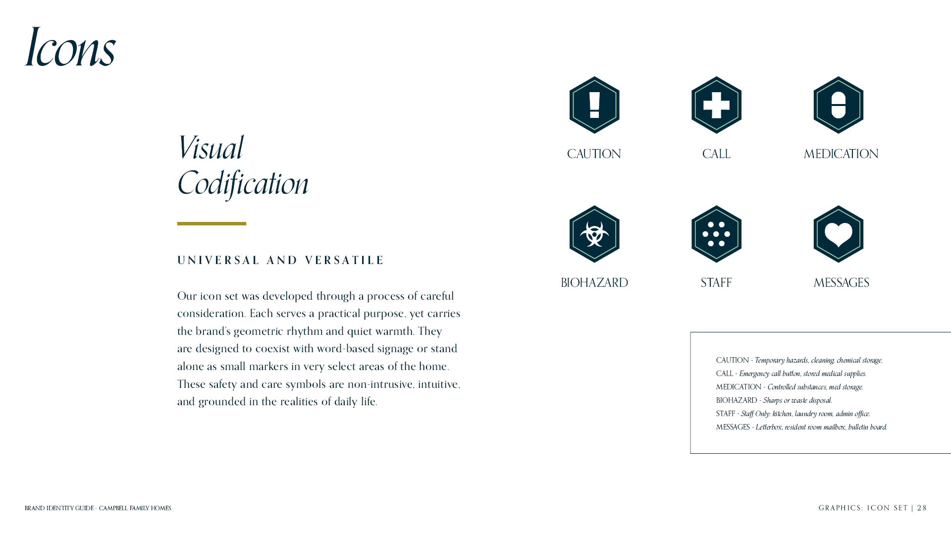
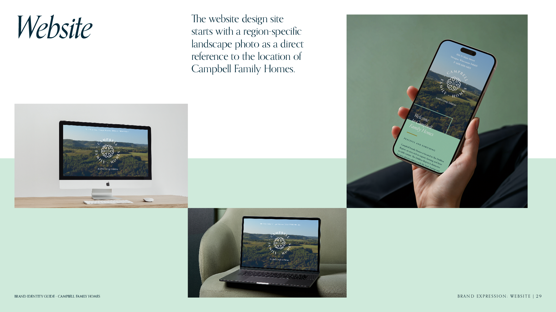
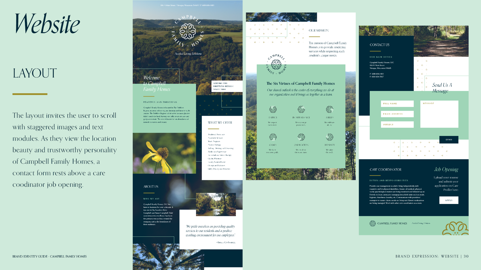
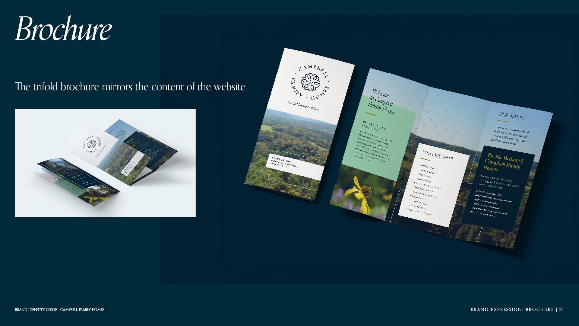
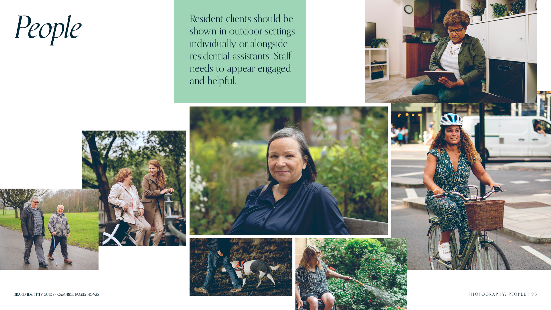
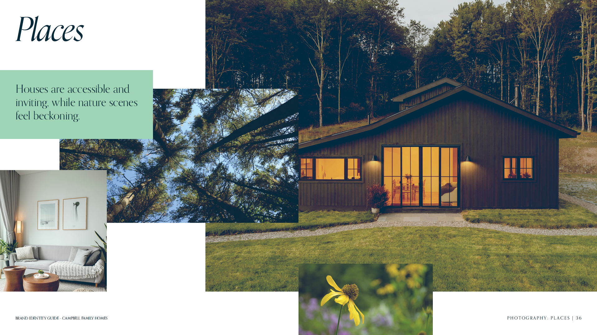
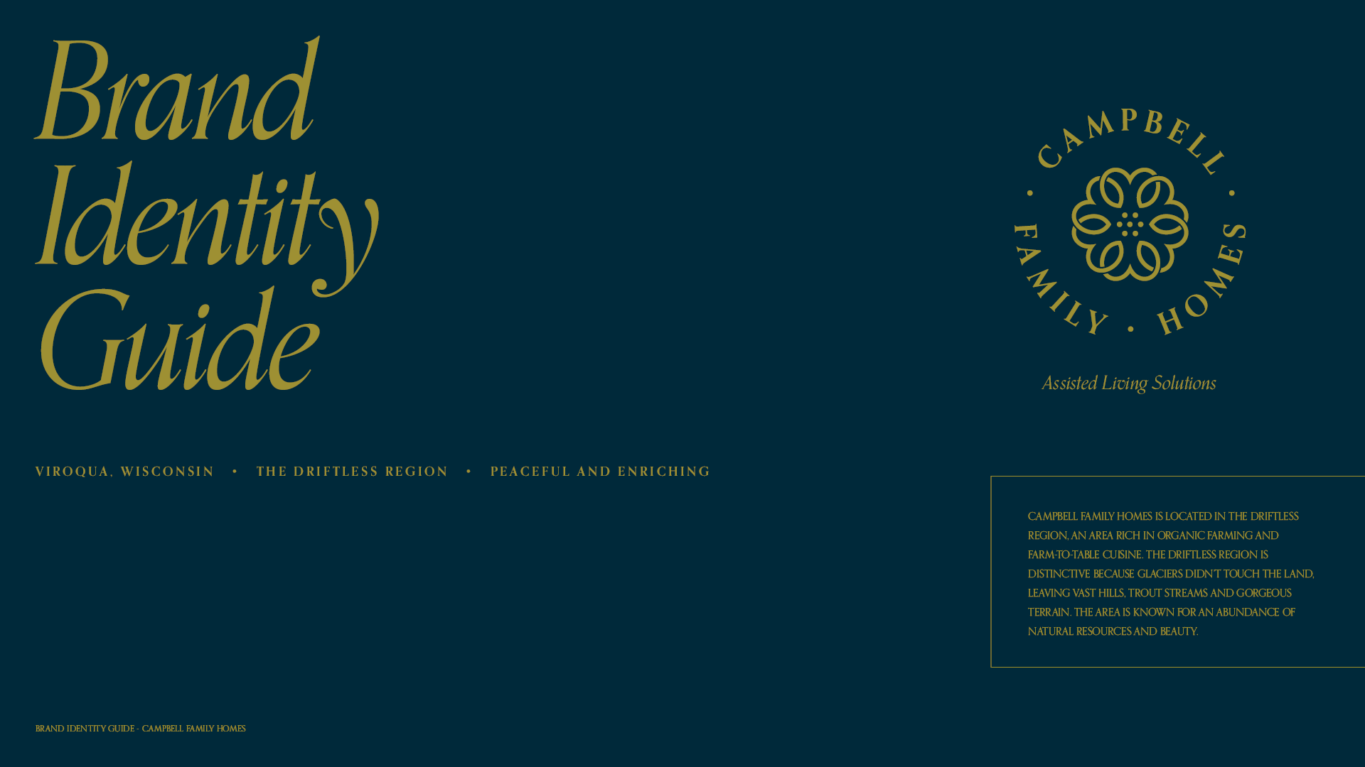
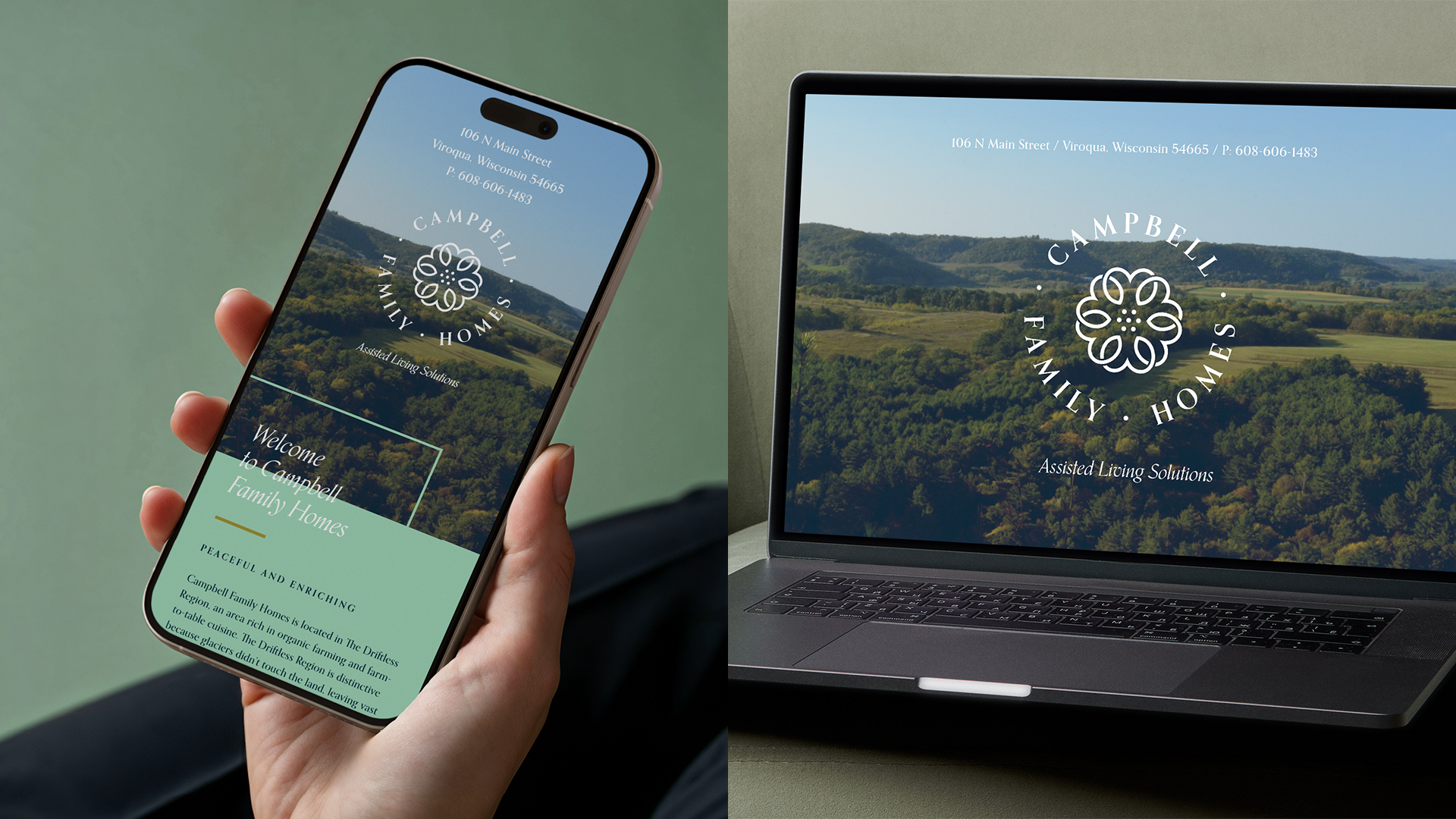
I designed a logo of six interwoven hearts for Respect, Independence, Ability, Goals, Unification and Honesty. The brand and single page site use my photography and place rooted cues to anchor the identity in Viroqua.
Outcome
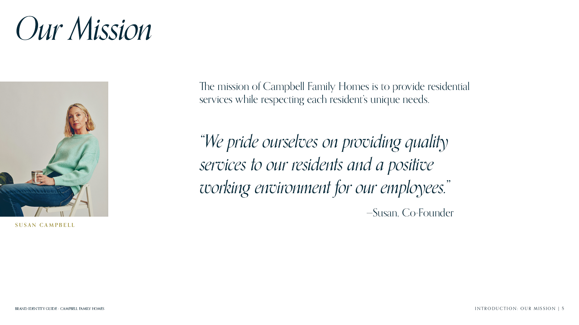
The identity is values driven and community centered, honors the region, builds trust and communicates commitment to compassionate assisted living.